
Futurism, the Byte + Neoscope
I have worked as the design director of Futurism since 2017.
I was brought on to the team in March 2017 as the first and only design and creative director of the publication. Over the course of those years I supported the Futurism editorial staff and content director Foster Kamer in the creation of original imagery and art direction, site and app redesign and branding, and the creation and branding of new and unique verticals.
In addition to this, I worked along side Futurism studios for the branding and logo design of original programs, oversaw the branding and identity for products created under Futurism Products (Gravity Blankets, CryptoCandle, Re: Recovery Wear) and worked with vendors to create original signage and environmental design elements for the workplace. I also worked with the agency and advertising teams to create decks and RFPs for potential clients.

The Staff


Because some of our staff were distributed, we had no easy way of having a unified employee photo aesthetic.
Instead I asked writers and staff to send me their best photos and I treated each in the style of the site’s general art direction. Our Slack conversations became colorful and bright, and the company had a unified feeling inside and out.

Art Direction


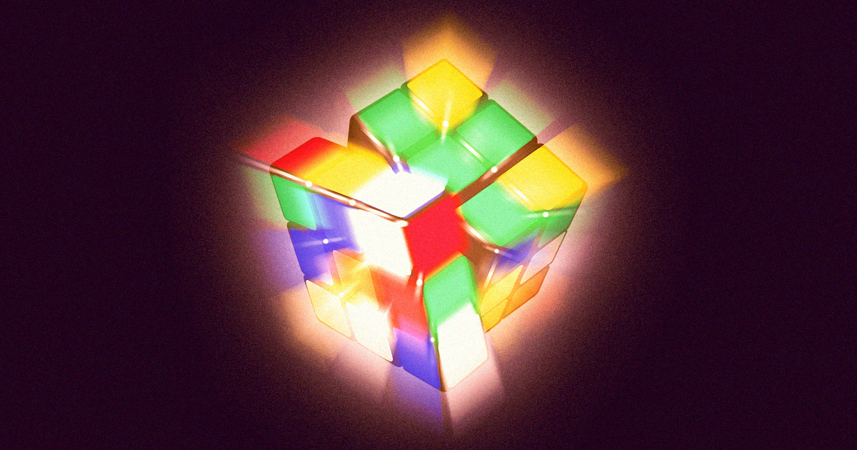


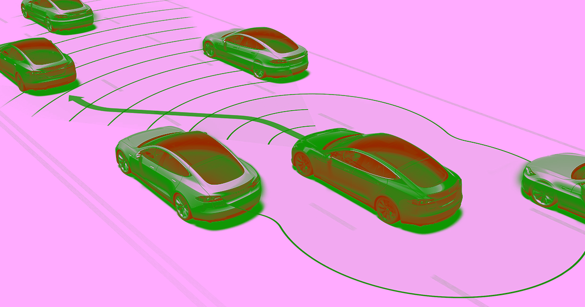


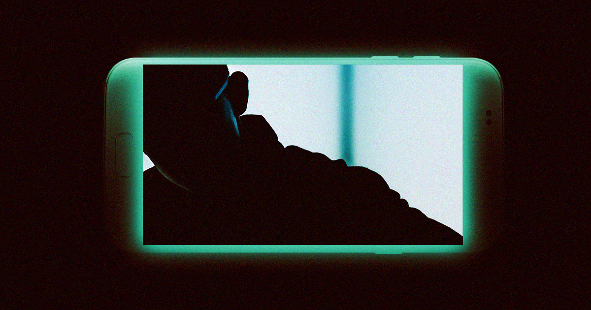
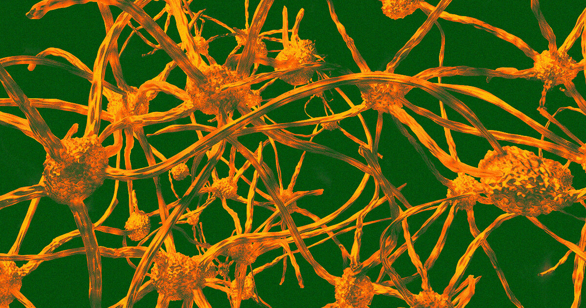


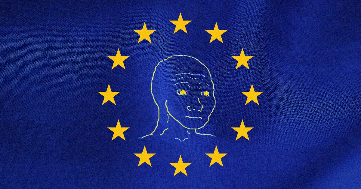


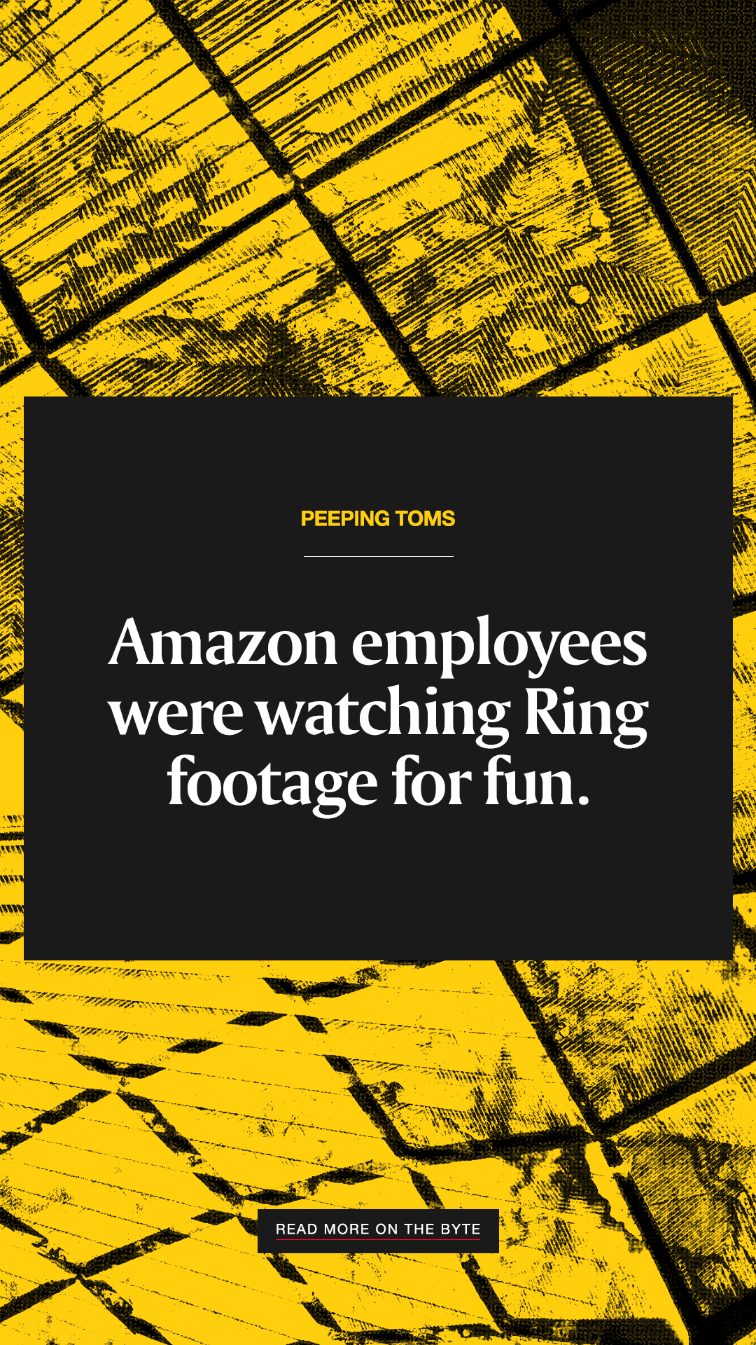
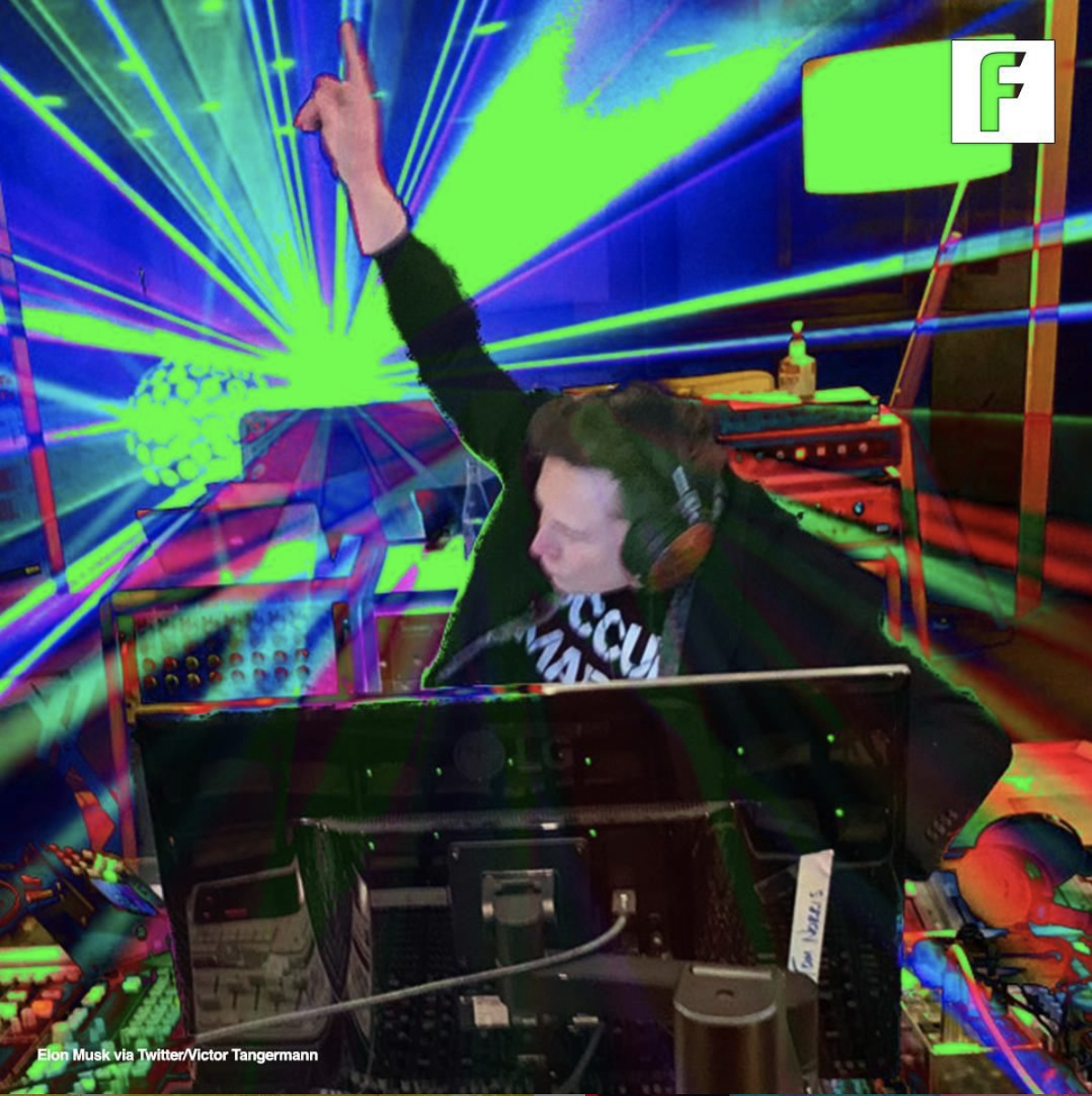
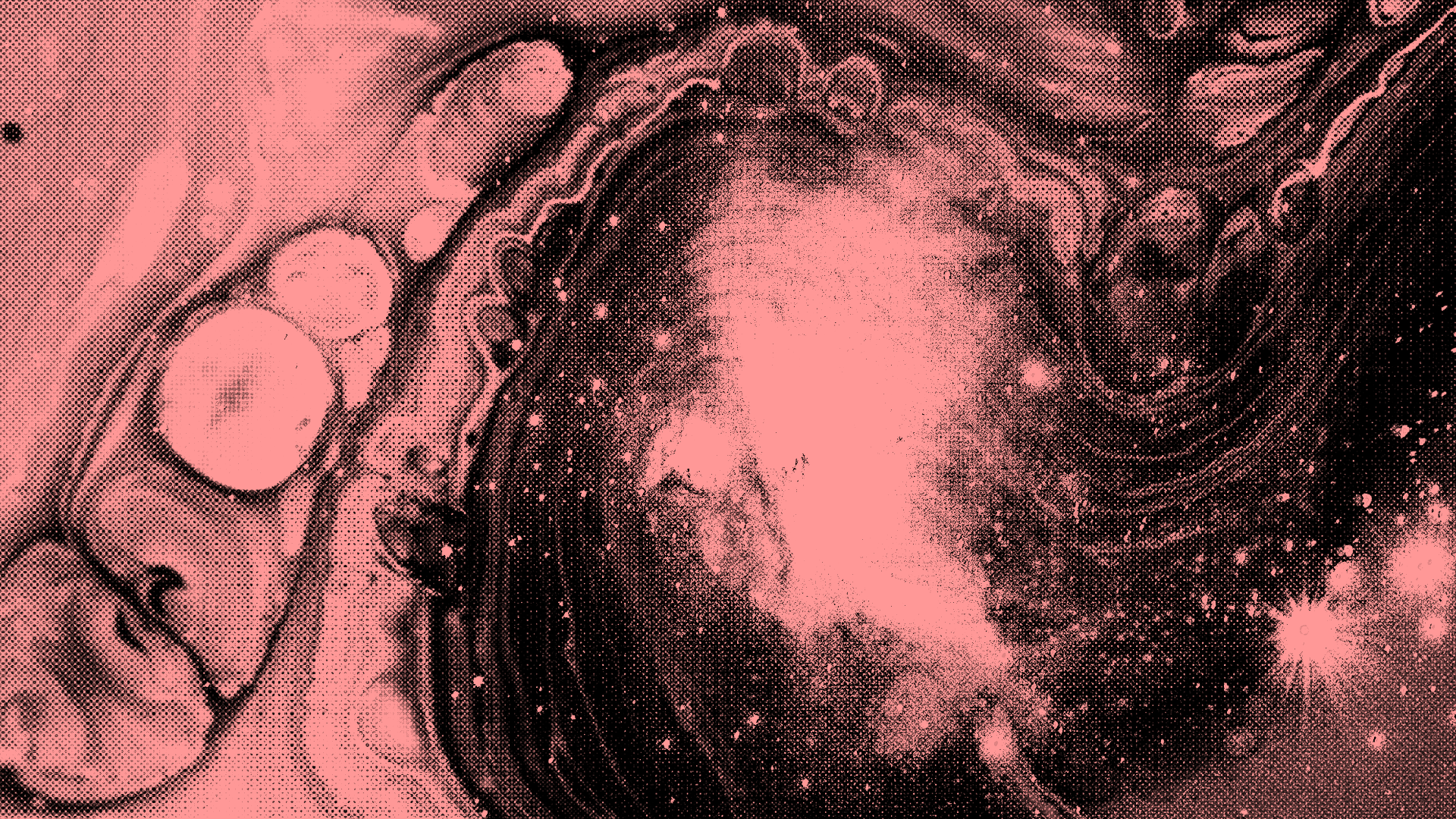
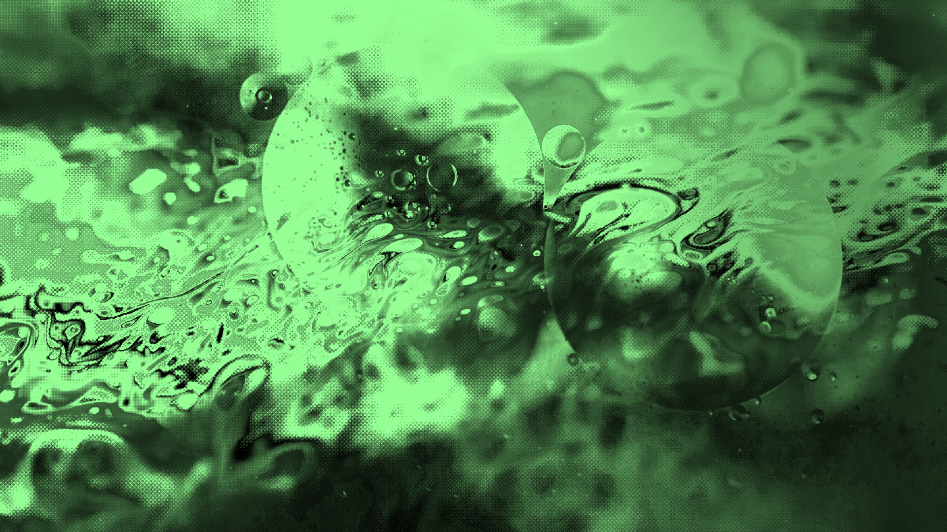
Futurism’s art direction comes both from necessity and an effort to make the often difficult and obtuse subjects they cover accessible to a popular audience.
When I joined Futurism they did not have much in the way of stock image subscriptions and had to rely on free stock image sites such as Pixabay and Unsplash, but even those did not provide the imagery capable of illustrating abstract topics. For that we had to rely on our own skills in Photoshop and a little talent. The resulting art direction is clean, fun, humorous, winking, and inviting.

The Logo
In 2021, Futurism introduced its new logo.
While we were undergoing our V3 transformation during the pandemic, I began tinkering with the logo — the single asset I was hesitant to change when I inherited the brand identity in 2017 when I joined the team.
The original logo, created by the site’s founder, was a simple word mark set in a font with sharp, geometric angles but nothing specific to the logotype itself. In reimagining the logotype, I kept took a favorite typeface from the 1970s, Neue Kabel, and updated it by introducing sharp angles and modifying the typeface.
Below you can see the original typeface setting, the final product, and the underlying architecture behind the logotype as well as the the design of the icon.

Agency Work


Social Media
Instagram Stories
Art Direction


Instagram Feed
Art Direction


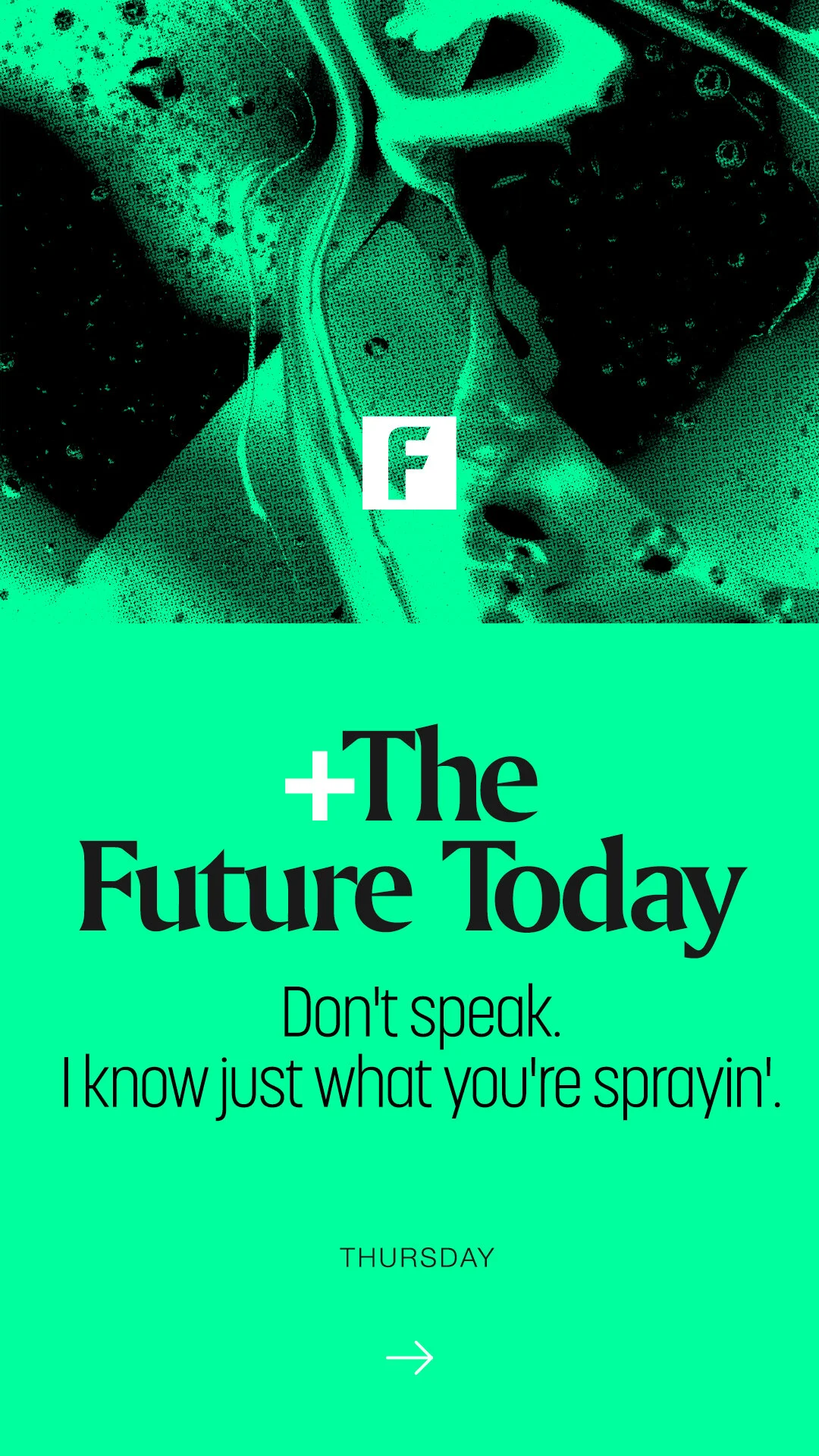
Daily Newsletter
Branding + Identity


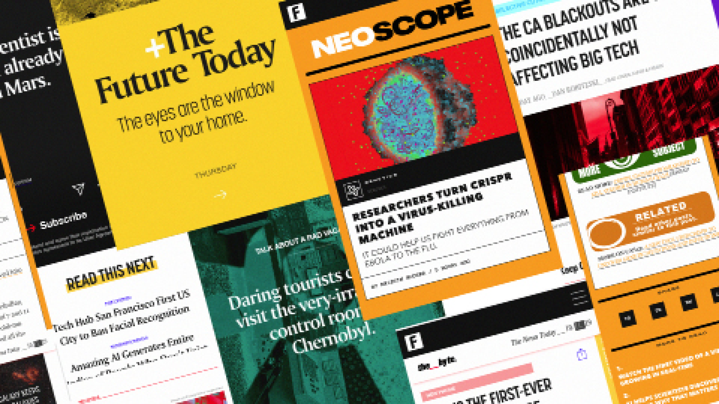
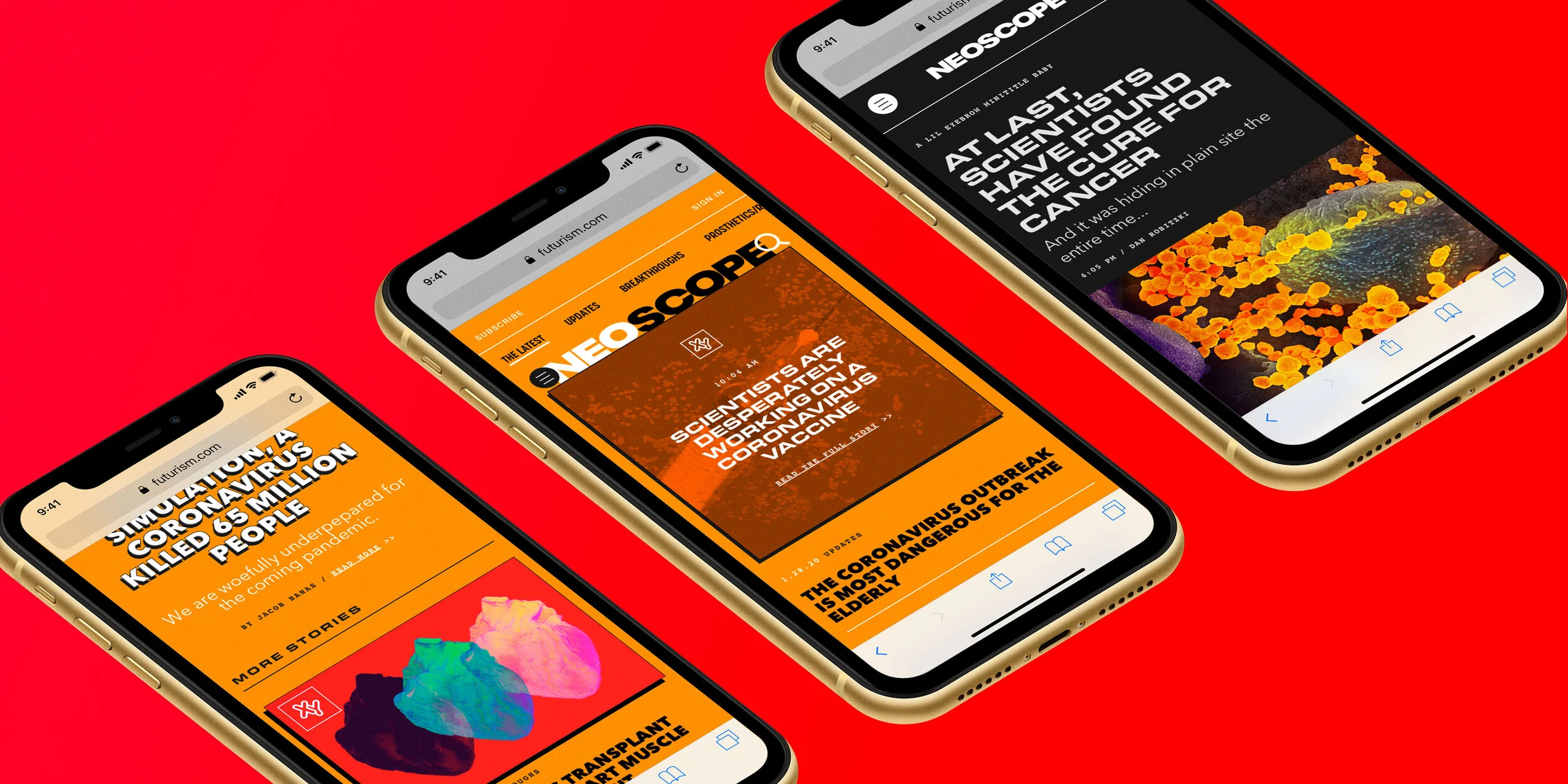
The Site, Verticals + App
Futurism + The Byte
Branding + Identity


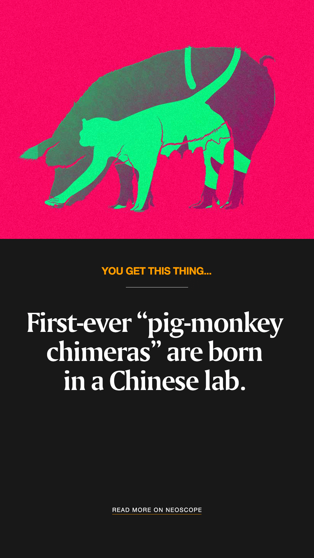
Neoscope
Branding + Identity


The Transactor
Branding + Identity
The Futurism App
UI / UX


Special Projects
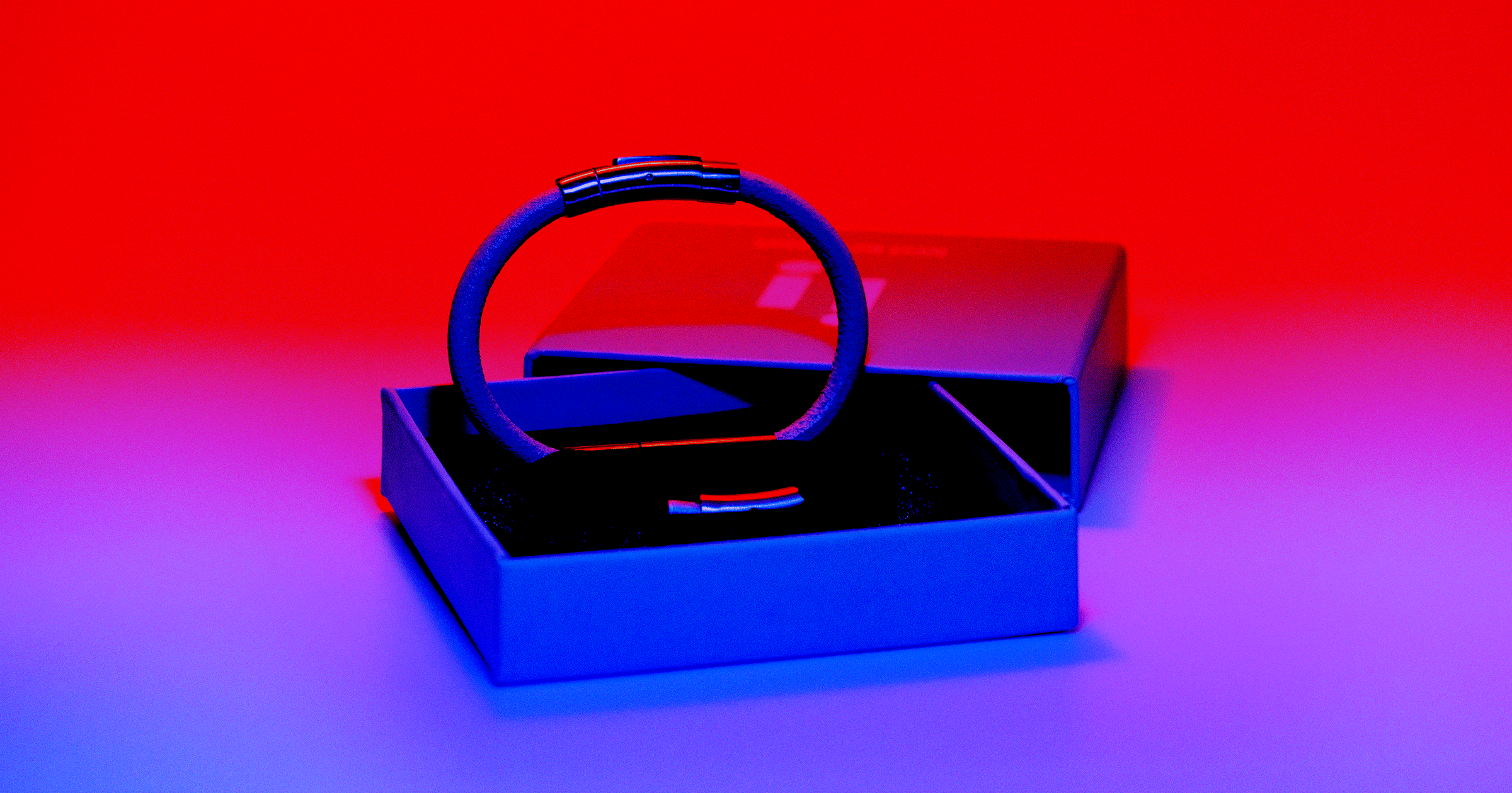
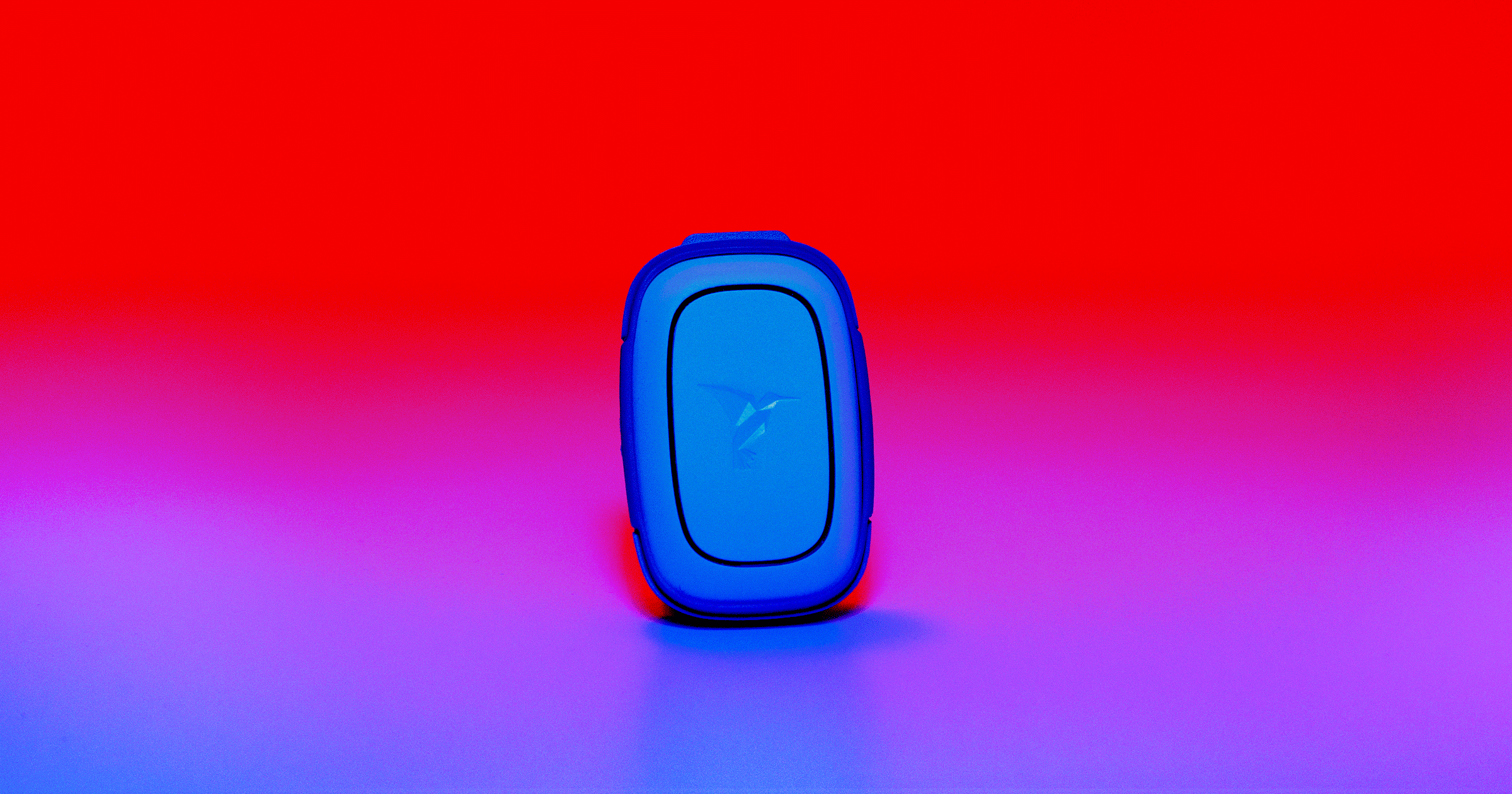
Assault Prevention Technology Feature Story
Art Direction + Photography